UX research & product design · Graduation project · 2023
Helping language schools refer students instead of turning them away
My role
My graduation project. I did the research, interviews, concepts, prototype and tests. The project started with Welcome App; Taalhuis Dordrecht became the main partner.
Design challenge
How can a data-driven online tool give the language schools in Dordrecht an overview of each other, so refugees can be referred and don’t lose their motivation?
The context
17
language schools in Dordrecht
4
language schools interviewed
3
concepts tested against the requirements
From my design rationale
Key insight
“Schools are already helped if they can see which schools are nearby and what they offer.”
From the interviews
Methods
Interviews
Customer journey
Fogg behaviour model
Requirements & job stories
Benchmark
Lo-fi & hi-fi prototype
Acceptance test
The broken journey
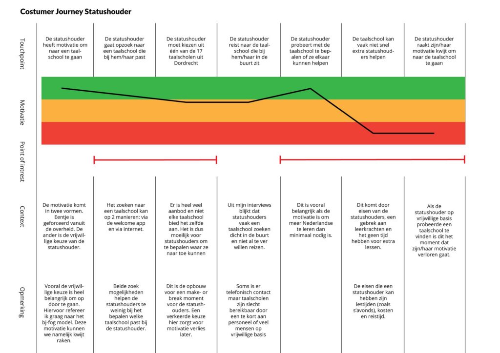
When a school can’t help a student, the journey simply stops at the front desk. The solution has to extend it.
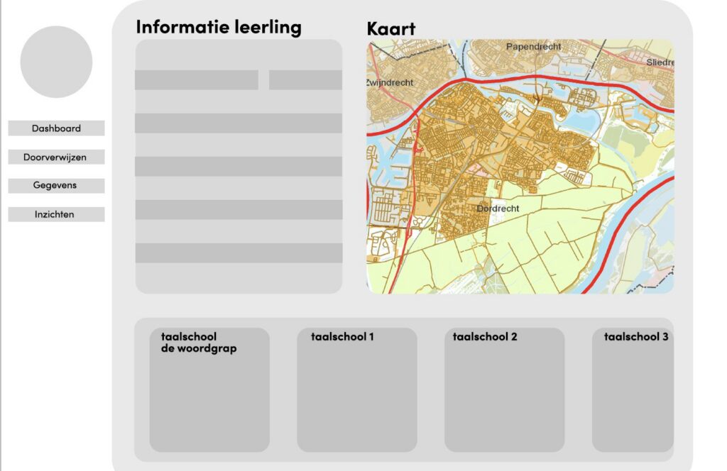
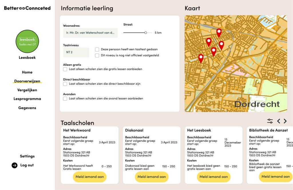
Lo-fi → hi-fi
The full story
01
The challenge
01
The challenge
On 1 January 2022 a new civic integration law came into effect: municipalities became responsible for the integration of refugees with a residence permit, which includes learning the language. During my orientation I got in touch with Taalhuis Dordrecht, an organisation that supports language schools. I found that refugees don’t learn enough during the mandatory integration course, so it’s important to help them with voluntary extra language lessons.
Refugees who want to keep studying go looking for a language school, but often knock on the wrong door: because of requirements like cost or distance, or because they only find out after a level test. A rejection at the front desk drops their motivation below the point where they keep looking.
02
Research: how I got there
02
Research: how I got there
Because the brief wasn’t clear yet, I needed to talk to the language schools themselves as soon as possible. These interviews became the foundation of the project.
01
Orientation
Welcome App and Taalhuis Dordrecht
02
Interviews
Four language schools in Dordrecht
03
Journey
Customer journey and Fogg behaviour model
04
Requirements
List of requirements and job stories
05
Benchmark
Filtering, data overviews and sharing information
06
Concepts
Three concepts, one prototype
What the interviews showed:
→ Schools can’t always help everyone who comes in for an intake.
→ Schools barely know about each other. Some don’t know the others exist.
→ Schools don’t know whether they still have a reason to exist within the municipality.
→ The most important data: location, target group, cost, lesson times and availability.
03
Key insights
03
Key insights
Collaborating means referring
The main goal is to refer students when they can’t be helped at the school they walk into.
Be careful with data
Schools are already hesitant and won’t use the product if they have to give away too much data.
Data driven
The data has to come from the schools, and they have to keep supplying it.
Keep it simple
Everyone at a school should be able to use it, including volunteers. No useless features.
Extend the journey
The opportunity isn’t in handling the rejection, but in a next step that’s very easy to take.
Discover the area
Schools are already helped if they can see which schools are nearby and what they offer.
04
Design decisions: what I found, and what I did with it
04
Design decisions: what I found, and what I did with it
Insight
In the interviews, referring students turned out to be the main way schools work together. The later interviews confirmed it.
Interviews
Decision
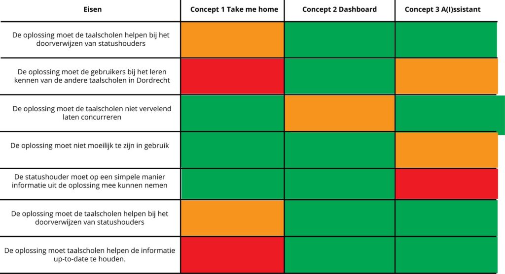
A dashboard, not an IoT device or an AI assistant
I scored three concepts against the requirements. The dashboard is the least experimental, but that’s its strength: anyone at a school should be able to refer a student with ease.
Insight
In the lo-fi version I combined referring and comparing. Testing showed this was impractical and confusing.
Lo-fi test
Decision
Separate flows, each with its own starting point
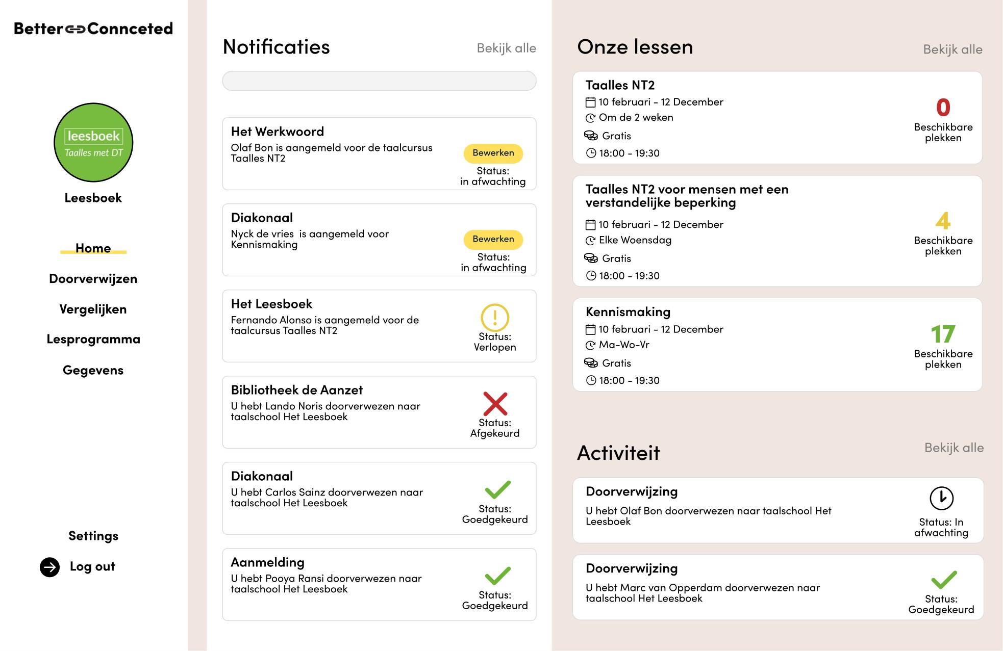
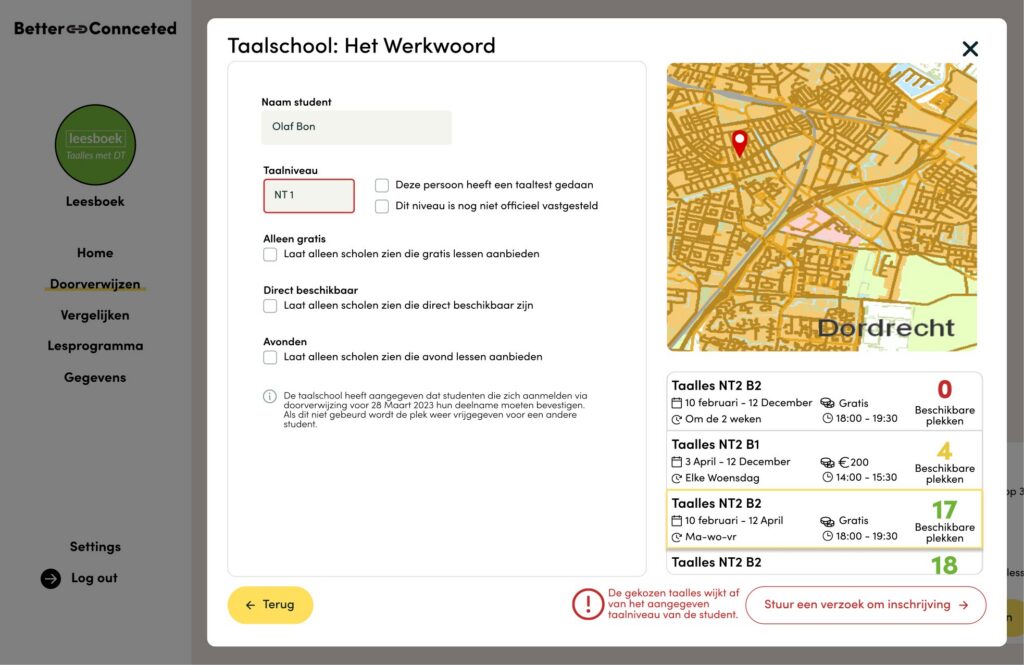
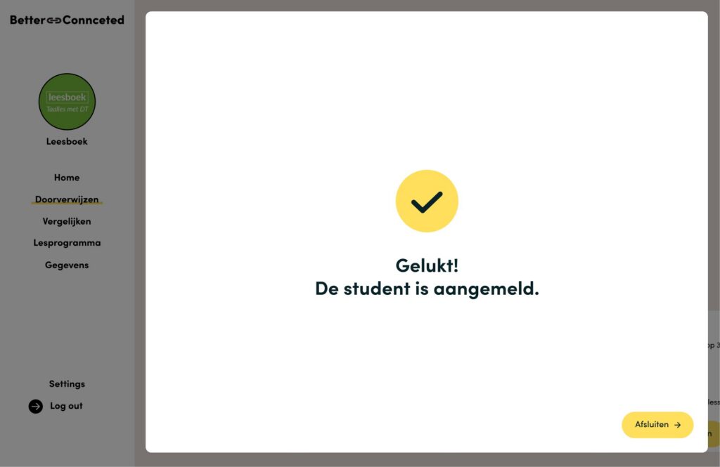
Referring got its own flow in three steps: choose a school, choose a class, check the student’s details. Home became an overview for the school.
Insight
Schools don’t want to share too much with each other. In the mid-term test, a participant said that with more data she would worry about what others could see.
Interviews and mid-term test
Decision
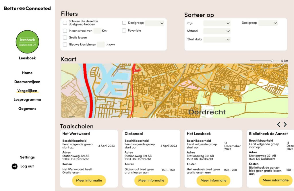
Compare shows just enough
Discovering already succeeds when schools get an idea of who is nearby. The compare feature does just enough to be valuable, and that prevents unpleasant competition.
What the acceptance test changed
In the acceptance test with the main stakeholder at Taalhuis Dordrecht, two remarks changed the design: show how many lessons a course has, and define how long a referral is “safe”. That led to a reservation being held for three days.
05
Result
05
Result
A clickable Figma prototype of the Better Connected dashboard: an overview home for each school, a three-step referral flow and a compare feature. When I asked how likely it is that it will actually be built, the stakeholder said:
“The chance is quite big. I can really picture it. The biggest problem is the financial side, but I’m convinced the solution will add value.”
Main stakeholder, Taalhuis Dordrecht
06
Reflection and next steps
06
Reflection and next steps
“I spoke to fewer language schools than I would have liked. But the mix was good, and deciding to talk to them early was a good choice: much of the information I could find online was outdated or wrong.”
The product still needs a few iterations. My advice to Taalhuis Dordrecht: have a larger group of schools review it before it’s 100% valid, set up a database, and give the screens where schools add lessons and fill in their details more attention.