Concept, visual & UI design · School project · 2019
Stories to read on the go, designed in the NS house style

My role
Individual project. I did the visual research, sketched and iterated the stories, and designed how they’re presented online and what interaction fits each story.
The brief
The NS wanted a website in their own style with stories for travellers to read on the go. Three stories, all based on the same plot from Raymond Queneau’s “Exercises in Style”.
The project
3
stories, each with its own mood
3
interaction concepts, one per story
1
overview page to find a story
From my documentation
House style analysis
“The NS images all radiate comfort, comfort for everyone.”
From my analysis
Methods
House style analysis
Grid analysis
Visual inventory
Sketching & iterating
Interaction concepts
HTML/CSS prototype
Starting from the NS house style

Colours, NS Sans type sizes, buttons and micro-interactions, all taken from the NS website before designing anything new.
Three stories, three moods


The full story
01
The challenge
01
The challenge
Three stories with the same plot, each told in a different style: De verwarde man (the confused man), Moe (tired) and De alwetende verteller (the omniscient narrator). Each story needed its own look and its own interaction, while the website still had to be recognisably NS.
I started with the NS itself: a house-style analysis and a visual inventory of their website, NS International and their social media, before designing anything new.
02
Research: how I got there
02
Research: how I got there
I analysed the NS house style first, then gave each story a mood word and searched for images, colour, form and typography that fit it. From there I sketched, iterated and designed the interaction per story.
01
House style analysis
Colours, NS Sans type sizes, buttons and micro-interactions
02
Grid analysis
A 2-column grid that turns into a 3-column grid
03
Visual inventory
NS website, NS International and Twitter
04
Mood words
Unrest, absent and confident
05
Sketching
Story pages and the overview
06
Interaction concepts
One interaction per story
03
Key insights
03
Key insights
Comfort for everyone
It doesn’t matter if you travel for work or for fun. Every NS image tries to speak to as broad an audience as possible.
“>” means clickable
The NS uses “>” for clickable items. On hover, the arrow moves closer to the text to show which item is selected.
Always recognisably NS
NS illustrations are simple, but you always recognise them as NS because the yellow-and-blue colour identity carries through.
04
Design decisions: what I found, and what I did with it
04
Design decisions: what I found, and what I did with it
Insight
The NS homepage uses cards with a header image, a title, a description and a link. For a stories page that’s exactly what you need.
Grid analysis
Decision
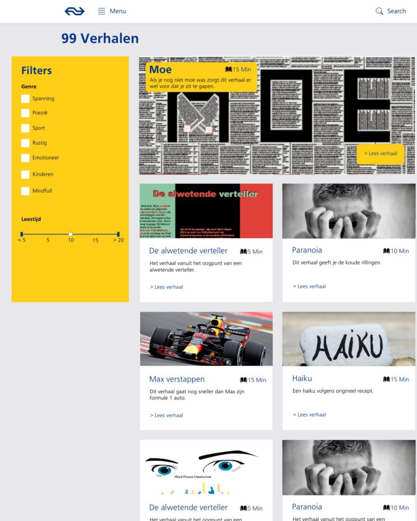
An overview page built from NS cards
“99 Verhalen” shows every story as an NS card with a header image, title, description, “> Lees verhaal” and reading time, with filters for genre and reading time.
Insight
The colour and form images I found for the mood word “unrest” inspired me to make a sort of cave drawing of the story.
Mood board: unrest
Decision
The mouse becomes a flashlight
In De verwarde man, the cursor has a see-through gradient, so you use your mouse as a flashlight while you scroll through the story. I added guidance lines so you don’t miss any text.

Insight
De alwetende verteller reads like a book.
The story itself
Decision
Flip through it like a book
I used the story as inspiration for the form and the interaction: you click the pages to flip through the story.

Staying NS while each story looks different
From my analysis: NS International swaps the characteristic yellow for the blue accent colour, which shows you’re on a different part of the website. But it keeps a similar top bar with the logo, so you know you’re in the right place.
05
Result
05
Result
Designs for the three story pages, each with its own mood and interaction, and the “99 Verhalen” overview page to find a story by genre and reading time.